
When the Flutter team at Google reached out, the brief was intentionally open-ended. They had built a new GenUI package and invited us, along with a few other companies, to experiment with it and contribute something back to the Flutter community.
GenUI itself wasn’t new territory for us. We had already taken generative interfaces into production and applied them in real customer solutions. What made this project interesting was the opportunity to apply those ideas using Google’s implementation and to turn that into something concrete and useful for others.
The goal wasn’t to ship a production-ready application but to take this emerging approach, apply it in a real use case, and share the results in a way that would benefit the wider Flutter ecosystem. That led us to a simple but important question: what kind of example would make the potential of GenUI tangible — not just in theory, but in practice?
Before getting into that, we need to take a step back.
What is GenUI, actually?
A simple way to understand Generative User Interfaces (GenUI) is through a LEGO analogy.
Instead of designing a finished interface, you provide a set of building blocks and the logic for how they can be combined. Based on a given instruction or user intent, those pieces are then assembled into a UI that fits the situation.
That’s essentially how GenUI works.
Rather than defining every screen in advance, you define a set of components, the rules that govern how they can be used, and the context that drives their assembly. From there, the interface is constructed dynamically instead of being pre-built.
This shifts the focus from designing outcomes to designing systems. You’re no longer crafting a specific layout for a specific scenario, but creating the conditions under which the right layout can emerge. In practical terms, this allows the UI to adapt based on who the user is, what data is available, and what they are trying to achieve at any given moment.

Choosing a use case that exposes the problem
Health applications are a good example of where traditional UI patterns begin to show their limitations. Information is often fragmented across different sections: lab results, prescriptions, appointments — and users are expected to navigate between them to build a complete picture. At the same time, what matters most can change quickly depending on the situation.
This often leads to what we’d call navigation fatigue: moving through multiple layers of the app just to answer a simple question or compare two pieces of information. Over time, the structure of the application starts to dictate the experience, rather than support it.
We chose this domain because it clearly highlights the tension between static interfaces and constantly shifting user needs.

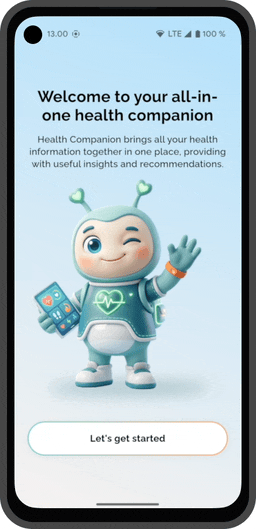
Rethinking the dashboard: the health companion
With that in mind, we built a demo “health companion” application using Flutter and the GenUI package. The core idea was to rethink the dashboard, not as a static overview of everything, but as something that continuously reorganizes itself based on relevance.
The interface is generated dynamically using a combination of user profile data, time-based context, and interaction with an AI assistant. Instead of presenting a fixed set of widgets, the app prioritizes what appears based on what is likely to matter most at that moment. An upcoming appointment might take precedence, while less urgent information moves into the background.
When users want to explore something in more detail, the experience doesn’t rely on navigating to a new predefined screen. Instead, it expands into a conversational interaction where data, insights, and actions are brought together in a single flow. The goal isn’t to remove structure entirely, but to make that structure flexible enough to adapt.
From idea to implementation in just two weeks
We built the entire demo in roughly two weeks, showcasing the power of Flutter and AI-augmented development. The focus was on defining components and shaping how the UI behaves — a shift from assembling views to designing behavior.

It’s very different from the traditional way of building UIs. It felt unusual at first, but once the core idea clicked, it became much easier. The first time we asked it to generate a login view felt almost magical — we had only set up the basics, and it was already producing a usable UI from the default components. It wasn’t always straightforward, but overall it was both challenging and fun to work with.
Alexander Troshkov, Senior Software Engineer, Codemate
Google’s GenUI package sits at the core of this. From the initial profile selection to the home view and the conversational layer, the UI isn’t manually constructed screen by screen — it’s generated based on context and intent using the same underlying component system.
At the same time, this approach isn’t without its challenges. The dynamic nature of the UI introduces a level of unpredictability that traditional development avoids. Components need to work in multiple contexts, and debugging becomes less about fixing a single screen and more about understanding how the system behaves.
Want to see how it works?
We’ve open-sourced the demo so you can explore the implementation in more detail and see how these ideas translate into code:
If you’re exploring similar ideas or thinking about how generative interfaces could apply to your own products, we’re happy to continue the conversation.
